39 Awesome Contact Us Page Examples You Need To See
1. Broker Notes
At first glance, Broker Notes‘ contact page looks pretty bare.
There’s no graphics, no quirky copy, just a plain old contact form.
Great for UX, but not so great for inspiring users to reach out.ADVERTISEMENTCONTINUE READING BELOW
So what stands out on this page?
The drop-down menu under “How can we help you?” lets users share the reason they are contacting the site.
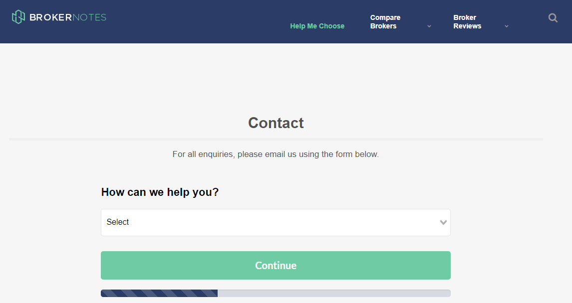
This makes it easier to sort through requests and respond to important contacts as soon as possible.
For example, if you select “I am a broker looking to advertise on Broker Notes,” it takes you to another form to share more information about your firm.ADVERTISEMENTCONTINUE READING BELOW
The little bar at the bottom lets you know how much time is left in the form, so users are less likely to get annoyed.
2. Sleeknote
Sleeknote uses a similar format to Broker Notes – they ask how they can help and provide links to book a demo or become a partner.
If the user needs something else, they are invited to fill out the contact form.
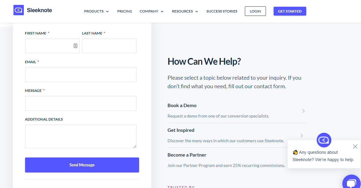
Another feature that stands out is Sleeknote’s live chat option, where users can reach out to learn more about what they offer or ask questions.
Try out the Future of Dynamic Backlink Management
Do you need a faster backlink checker? Semrush now has a high-speed backlink database plus a full suite of dynamic backlink management solutions.Try It FreeADVERTISEMENT
Making it easy to find information serves two purposes. It:
- Helps the customer find what they need.
- Reduces the number of contacts the brand has to manage.
In other words, it’s a win-win.
3. Yeti
Yeti‘s contact us page stands out for several reasons.
First, they offer a beautiful (and on-brand) photo background. It is striking without drawing away from the copy.
The copy is a bit cheeky, “While we’re good with smoke signals, there are simpler ways for us to get in touch.”

Below the fold, Yeti offers a range of resources, including product FAQs, info on warranties, and links to check gift card balances.ADVERTISEMENThttps://389a3debceb3b248076f6237e22bd0dc.safeframe.googlesyndication.com/safeframe/1-0-38/html/container.htmlCONTINUE READING BELOW
But they also don’t bury the contact info, which would just frustrate users.
Clicking on the “Send us an email” button takes you right to the contact form.
It’s easy to find but not too easy to find. (Which also helps keep away those pesky bots.)
4. BrightLocal
BrightLocal keeps their contact page simple but personalizes it with the names and faces of their support team.
This helps users feel like they are connecting with real people, not just a faceless brand.
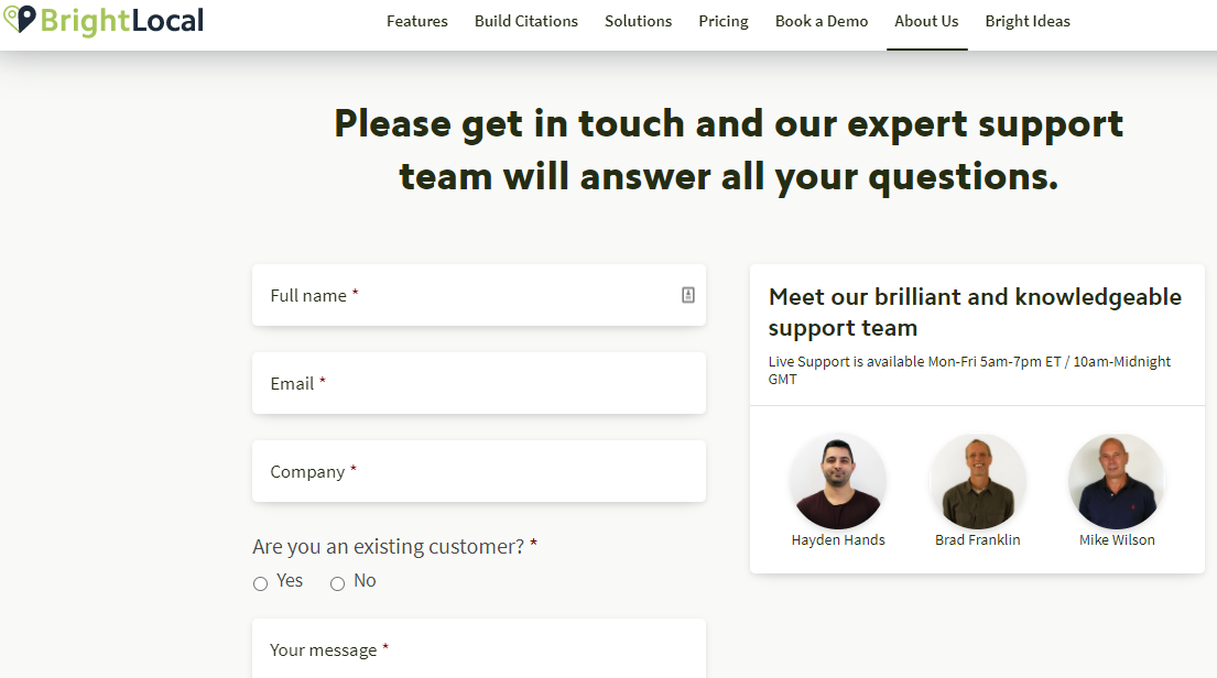
They also ask if users are a current customer, which lets them provide better service by understanding whether a contact is likely to have a question or need service.ADVERTISEMENThttps://389a3debceb3b248076f6237e22bd0dc.safeframe.googlesyndication.com/safeframe/1-0-38/html/container.htmlCONTINUE READING BELOW
5. RedBull
There’s a lot to love about RedBull‘s website, but their contact page really stands out.
Like Yeti, they use a striking image in the background.
They also provide a category drop-down so users can share what they need help with.
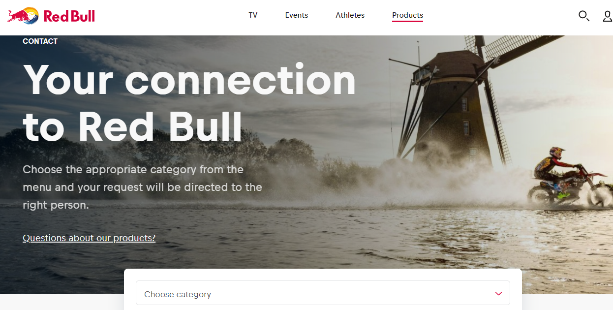
Just below the standard contact form, they provide a special form just for Press members, which is a nice touch (and likely cuts down on the number of press requests they get through their regular contact form!)ADVERTISEMENTCONTINUE READING BELOW
6. Chipotle
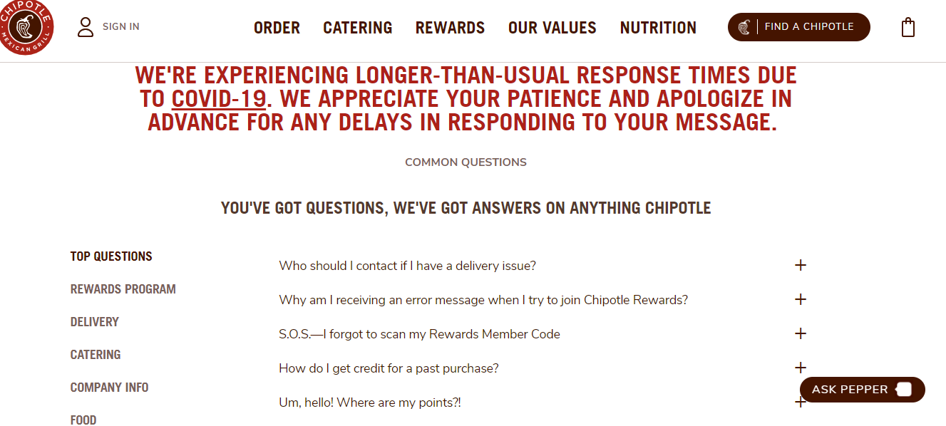
Chipotle‘s contact page starts off strong with a casual tone that fits with their corporate branding: “You’ve got questions, we’ve got answers on anything Chipotle.”
The page then offers an expansive list of FAQs (which, again, helps keep those contacts to a minimum).
There are two things I really love about this page.
First, they get all up in your face to let you know that response times are longer than normal.ADVERTISEMENThttps://389a3debceb3b248076f6237e22bd0dc.safeframe.googlesyndication.com/safeframe/1-0-38/html/container.htmlCONTINUE READING BELOW
Yay for setting expectations.
But they also have a chatbot that helps people navigate the FAQs.
Chipotle strikes the perfect balance between limiting the number of emails and still providing great customer service.
7. MeUndies
If fun undies are your jam, then you’ll want to check out MeUndies.
The brand offers a fun vibe, and it shows on their contact us page.
Like most other brands, they try to steer users to their help center first.
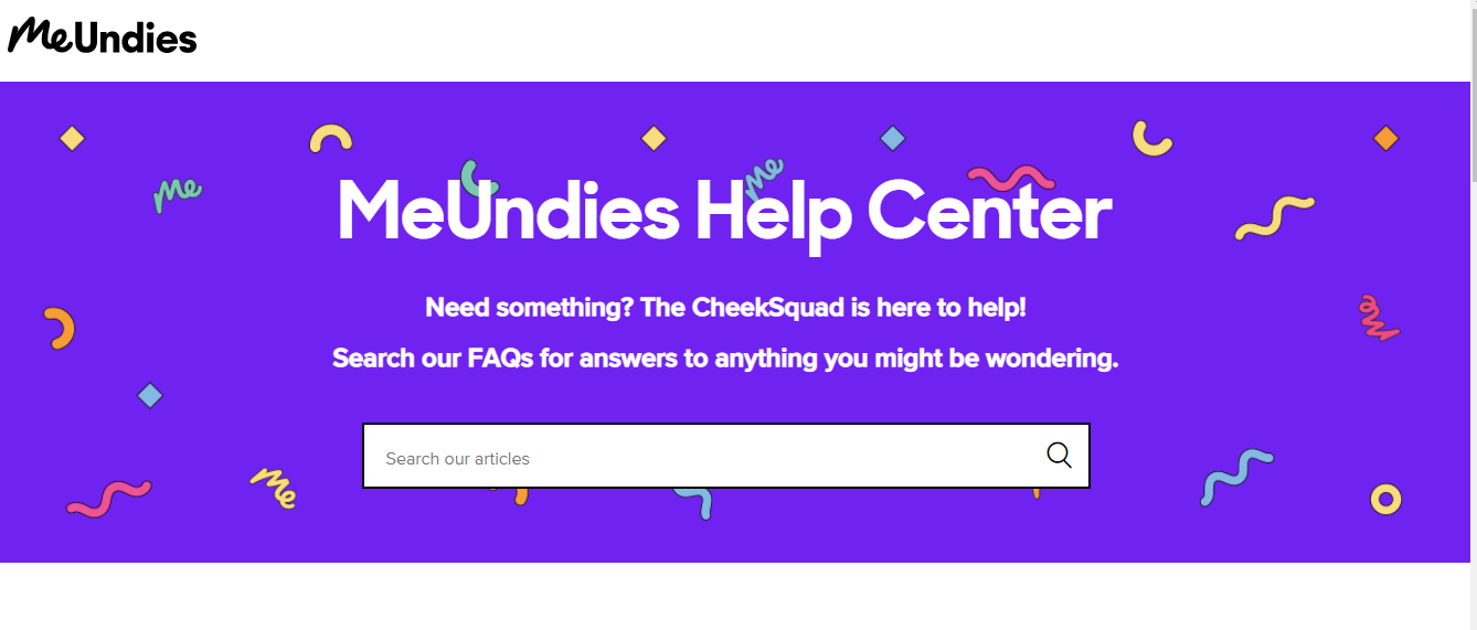
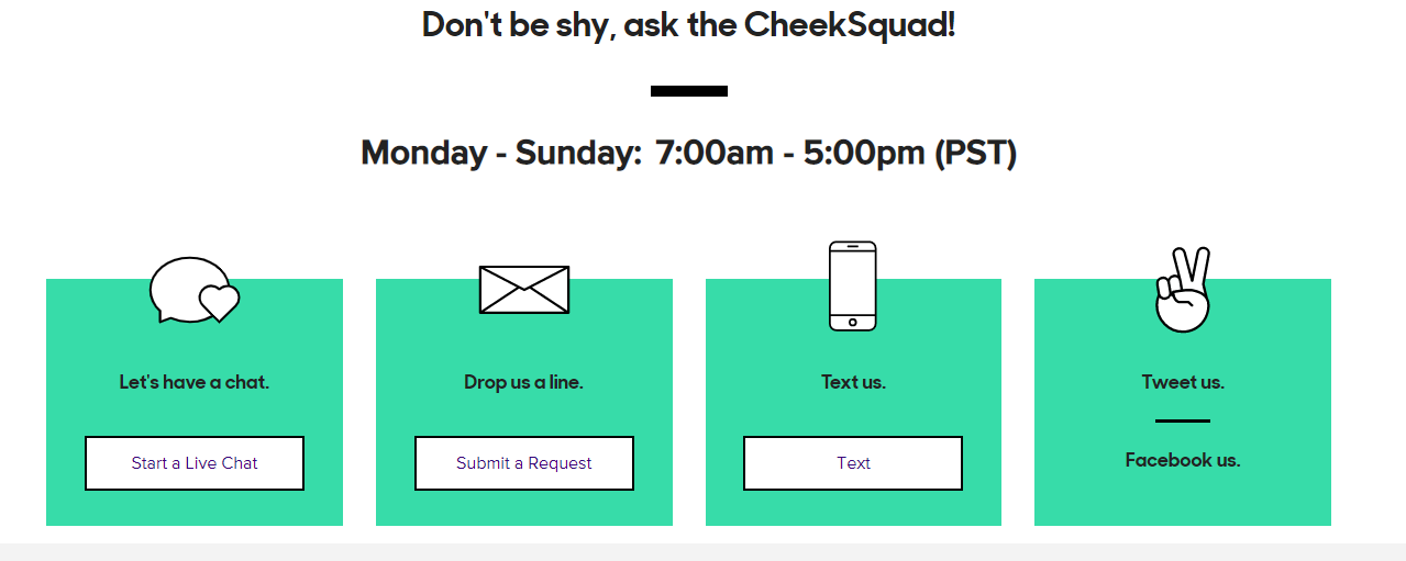
Can’t find what you need?ADVERTISEMENTCONTINUE READING BELOW
They make it easy to reach out to their “CheekSquad” by chat, email, text, or social.
8. Podia
How many times have you reached out to customer support and spent days waiting for a response?
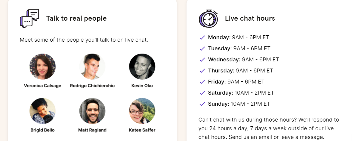
Podia starts out by highlighting their short wait time, which is really smart – especially as many people are working remotely these days.

They also share live chat hours and pictures of their support team to remind customers they’ll be talking to a real live person.
9. The Middle Finger Project
If you are looking for a book about getting unstuck and ridding yourself of imposter syndrome, I can’t recommend this book enough.ADVERTISEMENThttps://389a3debceb3b248076f6237e22bd0dc.safeframe.googlesyndication.com/safeframe/1-0-38/html/container.htmlCONTINUE READING BELOW
But, we’re here to talk about contact pages.
So, here’s The Middle Finger Project’s contact page:
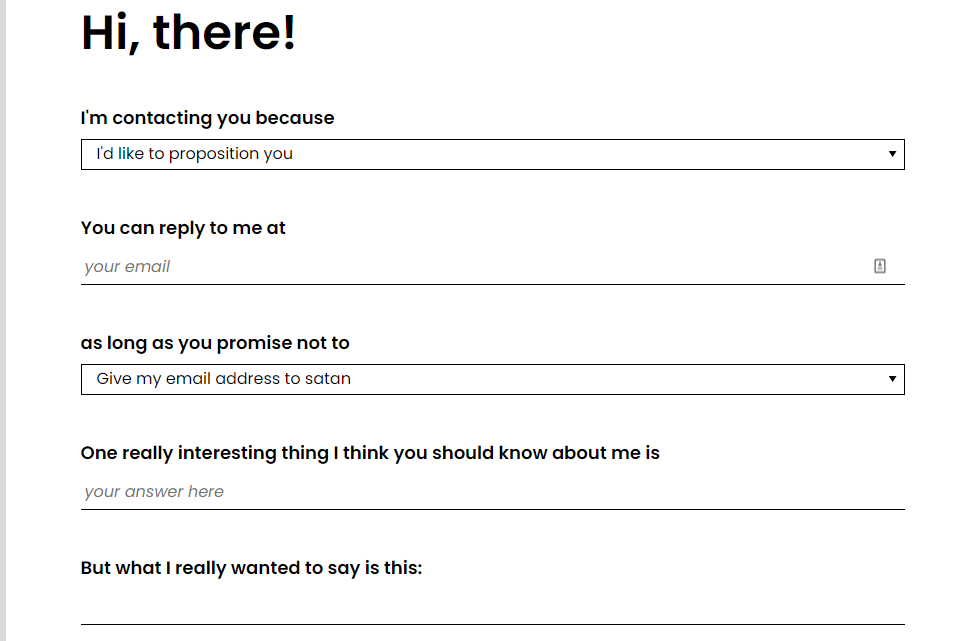
Form-wise, it’s not super exciting, right?
But I love the cheeky language and “What I really want to say is…” and the send button:

I’m not sure what the average speed of a pack of wolves is, but it sounds good.
Who said contact pages had to be boring, anyway?ADVERTISEMENThttps://389a3debceb3b248076f6237e22bd0dc.safeframe.googlesyndication.com/safeframe/1-0-38/html/container.htmlCONTINUE READING BELOW
10. Brands to life
Brands to life is an Australian-based branding and creative agency that helps, well, bring brands to life.
They have a unique brand that is simple and straightforward.
Their contact page includes all the standard information — name, location, email, and so forth.
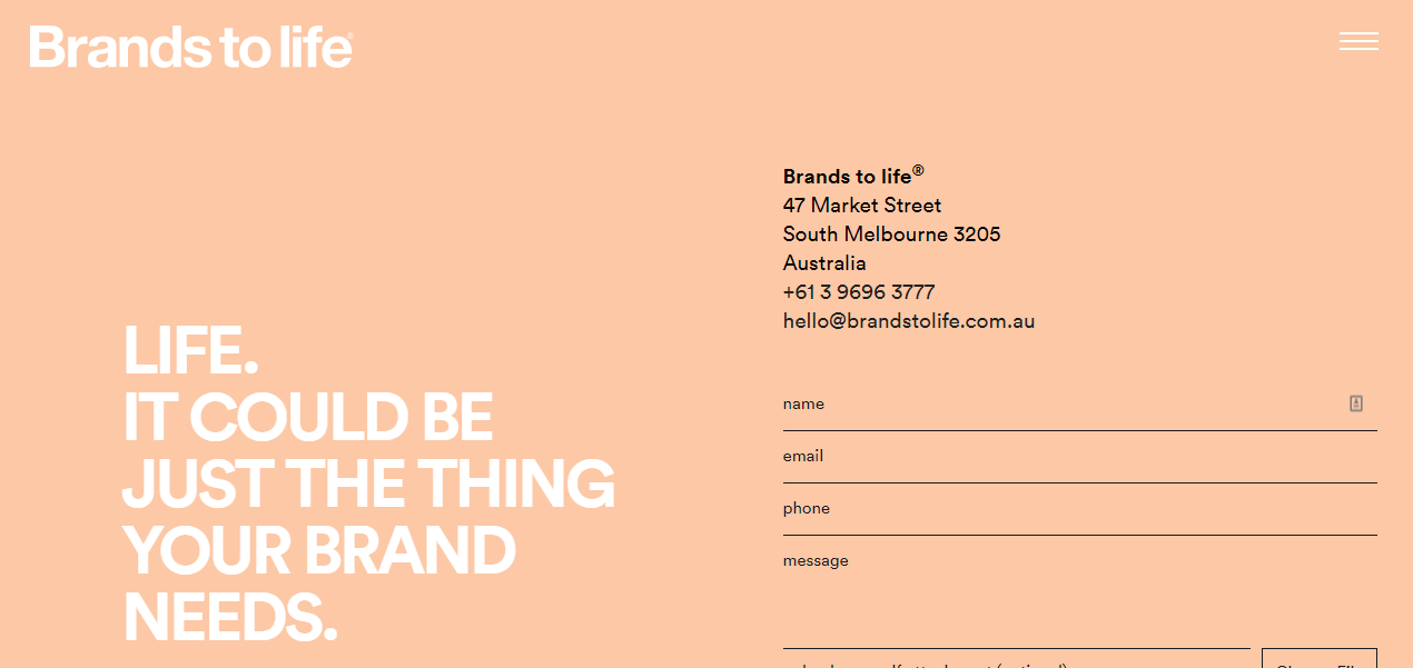
The page feels plain, but it fits with the rest of their site and their overall branding, which lets the user know who the brand is and what they can expect.ADVERTISEMENThttps://389a3debceb3b248076f6237e22bd0dc.safeframe.googlesyndication.com/safeframe/1-0-38/html/container.htmlCONTINUE READING BELOW
This just goes to show that contact pages don’t have to be fancy – especially if your brand’s personality is simple.
11. Kick Point
Kick Point does a great job of weeding out people they don’t want to work with right from the start – “Don’t address your email to us “Dear Sirs.” is a pretty strong statement to have top and center on your contact form!
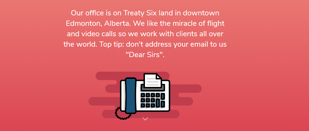
A bit further down the contact page, the team shares how long they take to respond.ADVERTISEMENThttps://389a3debceb3b248076f6237e22bd0dc.safeframe.googlesyndication.com/safeframe/1-0-38/html/container.htmlCONTINUE READING BELOW
It’s all relatable and on-brand.
I dig it.
12. Leeds Golf Centre
What does a golf course have to teach us about creating an awesome contact page?
First, they make it easy to book online, which is likely the main reason folks head to their website.
Smart.
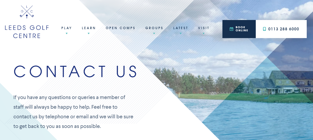
A bit further down they list all their contact info – phone, email, even fax.
But what really stands out is their contact form, which features a nifty little checkbox for folks to sign up for their newsletter.
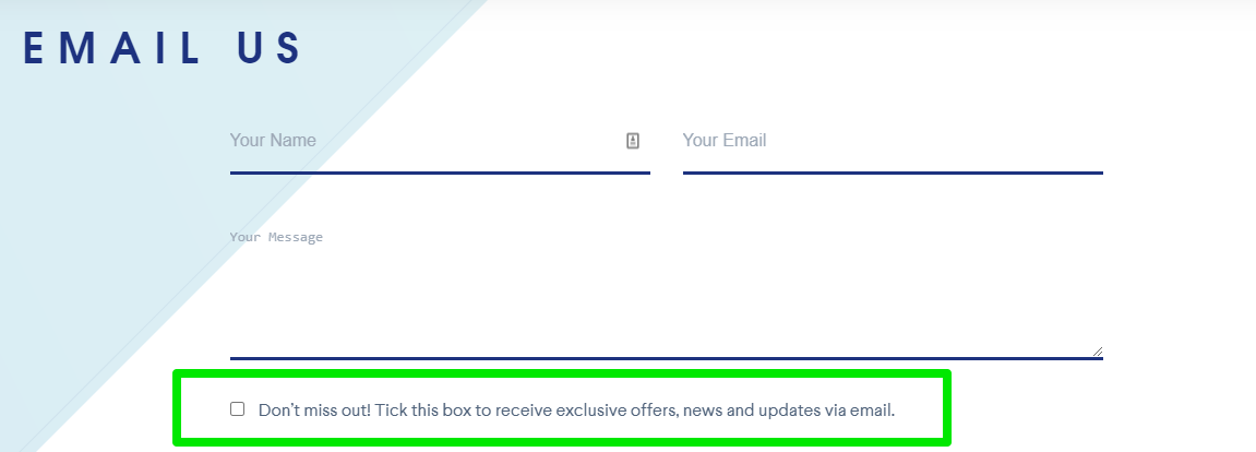
Users have to check the box – they aren’t being sneaky – but it’s an easy way to increase newsletter sign-ups.ADVERTISEMENThttps://389a3debceb3b248076f6237e22bd0dc.safeframe.googlesyndication.com/safeframe/1-0-38/html/container.htmlCONTINUE READING BELOW
13. Nebular
Nebular is a U.S.-based digital development agency.
Their website is bold and loud, and their contact page sticks to that theme.
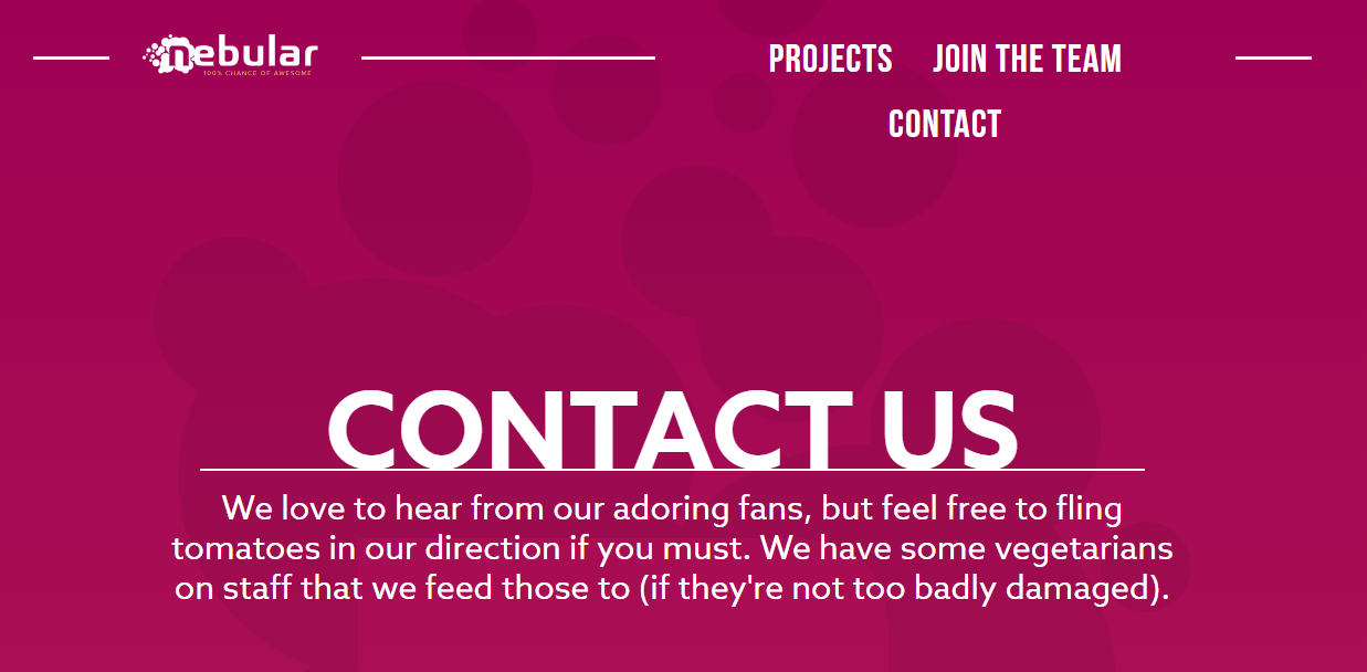
The self-deprecating humor shows off who they are as a business in just a few lines and the bold colors are carried over from the rest of the site.
Simple, but effective.
14. Basecamp
Who is on the other end of that contact form?ADVERTISEMENThttps://389a3debceb3b248076f6237e22bd0dc.safeframe.googlesyndication.com/safeframe/1-0-38/html/container.htmlCONTINUE READING BELOW
With some companies, you’ll never know.
Basecamp, however, shows off their teams smiling (though drawn) faces right at the top of the contact form.
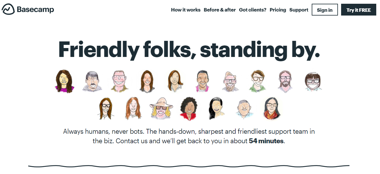
They also include links to sign up, learn more about their offerings, and pricing.
As a result, their contact page feels welcoming and easy to use.
15. ConvertKit
ConvertKit is known for its automated email service tools designed to help customers get the most out of their marketing.ADVERTISEMENThttps://389a3debceb3b248076f6237e22bd0dc.safeframe.googlesyndication.com/safeframe/1-0-38/html/container.htmlCONTINUE READING BELOW
Their contact page highlights one of their main goals – customer success.
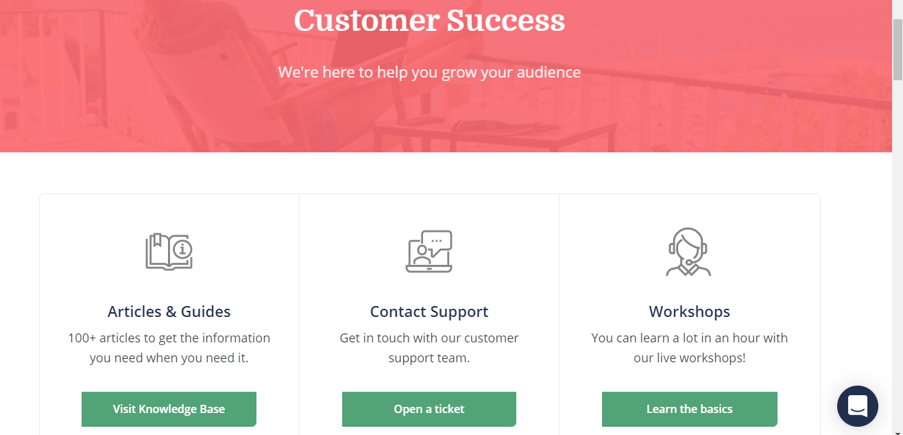
Just below the hero image, customers can click to visit the knowledge base, reach out to support, or learn the basics in their workshops.
And, like many other brands, they offer live chat right on the contact page which can help reduce customer frustration by helping them find the info they need right away.ADVERTISEMENThttps://389a3debceb3b248076f6237e22bd0dc.safeframe.googlesyndication.com/safeframe/1-0-38/html/container.htmlCONTINUE READING BELOW
16. Moon Pie
Moon Pie has one of my favorite brand Twitter accounts (seriously, check it out), so I was going to go check out their contact page for this list.
Sadly, there was none of the tongue in cheek charm to be found on their contact page, but it is incredibly well laid out.
For starters, they offer easy links to call or contact each of the brand’s locations — and show where to place wholesale orders.
t post. Edit or delete it, then start writing!
